top of page

Outcome
I Designed a B2B SaaS Competitor Intelligence Feature that saw 4 times our goal of MM/ENT accounts
4x
medal
of overall MM/ENT usage goal
335
arrow-pointer
unique user sessions (first 36 days, low volume B2B SaaS)
60% ($2.08M ARR)
chart-line
of goal of targeted enterprise level account usage achieved


dollar
ANNUAL REVENUE
$171 Million
network-wired
COMPANY SIZE
~1,000
briefcase
INDUSTRY
MarTech
display
PRODUCT TYPE
B2B Saas
users
Team
PM + UX + Lead Dev
user
My Role
Sole Designer
laptop-code
Feature
AI-Enabled Insights
wrench
Project Type
Net-new feature
Business Needs
Our Competitor Tool is a key differentiator in the MarTech space, but user engagement drops after onboarding when users struggle to understand how to apply the data to their business.
A Frequent Pain Point
From research in this area we knew that customers were struggling to know what to do with the data...
...the only thing we have [...] right now is a number and it would be great if there was something different to evaluate that wasn’t just a number. [...] we struggle to know exactly what to focus on..
Global fast-casual chain
Rephrased to anonymize customer
drumstick-bite
Idea
The solution became obvious: leverage an LLM to do do the hard work of figuring out what to focus on. This long-standing problem was easily solved and scaled by emerging tech.

How Can We Fit This Into Our Existing Platform?
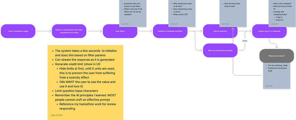
We started with the idea of common chat-based concept that takes the users’ filters for date range, competitor locations, and review sources (Google, Yelp, UberEats, etc.)
A major design challenge was figuring out how to elegantly fit this feature into an existing product


Mid-Fi Rejects
After moving to mid-fi there were several designs that didn’t make the cut

Designing for Engagement
The final designs were optimized to achieve product goals
-
Normally page-level features hide behind a CTA in the top bar
-
Product success was based on user engagement
-
I designed a solution on the same page where customers could use the feature with a single click, which got 159% more interactions than the traditional CTA


Ultimate User Freedom
We gave users access to all of their competitors reviews in our system. They can query the data in almost any way. Just ask!

bolt-lightning
Key Design Decision
Credit limits exist for each account. So as not to create a feeling of scarcity, which could discourage usage, we only display credit counts when they fall below 25%. This is how a simple design decision can impact product/business metrics.
Results
We saw strong usage upfront and continue to monitor
-
We saw our overall mid-market and enterprise user base exceed goals by 4x
-
Saw 335 unique sessions access feature in first 36 days (low-volume B2B SaaS)
-
Of our targeted enterprise customers we’ve seen 60% of goal use the feature (accounting for over $2 million in ARR)
Next steps
-
We constantly measure and monitor and have already made several meaningful changes
-
One specific thing we have monitored is the load time and how they relate to bounce rate
-
We’ve redesigned the waiting experience and area already seeing very positive results.
bottom of page